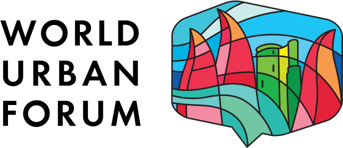
When tradition meet the future: the story behind the WUF13 logo
Developed jointly by UN-Habitat and the Government of Azerbaijan, the WUF13 logo reflects both the Forum’s theme “Housing the world: Safe and resilient cities and communities” and the character of Baku, its host city. Designers worked closely with local experts to create a visual identity that resonates globally while honouring national traditions and contemporary urban transformations. Watch the story here.
The design brings together two of Baku’s most recognizable landmarks. The Maiden Tower represents the city’s deep historical roots and enduring heritage, while the Flame Towers symbolize modern Baku and its dynamic urban development. Together, they capture the dialogue between past and present that defines the city today.


Flowing lines reference both the movement of wind – a nod to Baku’s identity as the “City of Winds” – and the ideas of energy, connection and exchange that sit at the heart of the World Urban Forum.
The mosaic pattern draws inspiration from Azerbaijan’s traditional stained glass craftmanship, Shabaka. This element celebrates diversity, resilience and unity, values that are central to the Forum’s mission. The vibrant colours themselves carry meaning: green for sustainability and growth, blue for the waters of the Bay of Baku, while red signals the urgency of the global housing crisis that WUF13 will examine.
Together, these elements tell a story of tradition meeting innovation – and of a city ready to host a global conversation on housing, resilience, and sustainable urban futures.
Follow our journey towards WUF13 at wuf.unhabitat.org/wuf13.